Data tells you what happened. Stories tell you why.
But when you are dealing with hundreds of video diary entries, turning those individual stories into a cohesive narrative can be intimidating.
This is where our AI-powered Journey tool steps in. By automatically plotting participant touchpoints on a clear timeline and using sentiment analysis to reveal emotional highs and lows, we help you spot meaningful patterns instantly.
Whether you are looking at shoppers, patients, or employees, here are three specific journeys you can map today to uncover the reality behind the data.
1. The Customer Journey: “The Path to Purchase”
- The Challenge: Brands often have a gap in their understanding between a customer seeing an ad and actually buying the product. You know they dropped off, but you don’t know why.
- The Journey: Imagine following a shopper’s journey over a two-week period. With Field Notes, you aren’t just getting survey responses; you are seeing the experience through their eyes.
- The High: The AI might detect a “High” sentiment score when they first discover the product online and unbox the delivery.
- The Low: It might spot a sharp “Low” (frustration) during the checkout process or when they can’t find the item in-store.
- The Result: You see exactly where you are losing customers, backed by video evidence of their friction. Instead of guessing if the price or the packaging was the problem, you can watch the exact moment their enthusiasm turned to annoyance.
2. The Patient Experience: “The Path to Diagnosis”
- The Challenge: Healthcare isn’t just clinical; it’s deeply emotional. Standard trackers often miss the anxiety of waiting for results or the confusion of starting a new medication.
- The Journey: Using our secure, privacy-first platform, you can witness a patient’s first 30 days on a new treatment.
- The Baseline: The timeline visualises the initial anxiety (Low sentiment) before the first appointment.
- The Dip: You might see a dip in sentiment caused by the confusion of reading a complex information leaflet.
- The Stabilisation: Finally, the map shows the eventual stabilisation (High) as the treatment takes effect.
- The Result: Pharma and healthcare teams can identify the exact moments where patient support materials are failing. It moves the conversation from “compliance” to “empathy,” helping you design better support systems.
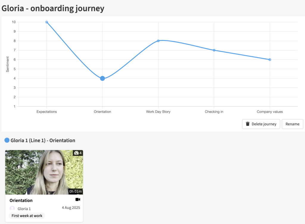
3. The Employee Experience: “The First 90 Days”
- The Challenge: High turnover often happens because onboarding processes look good on HR paper but feel less straightforward in reality.
- The Journey: Instead of a generic “Exit Survey” when it’s too late, use journey maps to track new hires in real-time.
- The Honeymoon: You might see high excitement on Day 1 (High sentiment).
- The Reality Check: This is often followed by a steady decline in sentiment during Week 2 as they struggle with IT setup or lack of guidance.
- The Result: HR teams can pinpoint the precise “moment of doubt” where intervention is needed to improve retention. Unlike marketing tools designed to create polished employer branding content, Field Notes captures the authentic, unvarnished reality of the workplace, allowing you to fix culture issues before your talent leaves.
Ready to see the whole story?
Whatever your journey, don’t let your insights get lost in a spreadsheet. Book a Demo today to see our AI Journey tool in action and start visualising the moments that matter.